← WorkCase study 01 / 04Experience & art direction
Rolex Experience
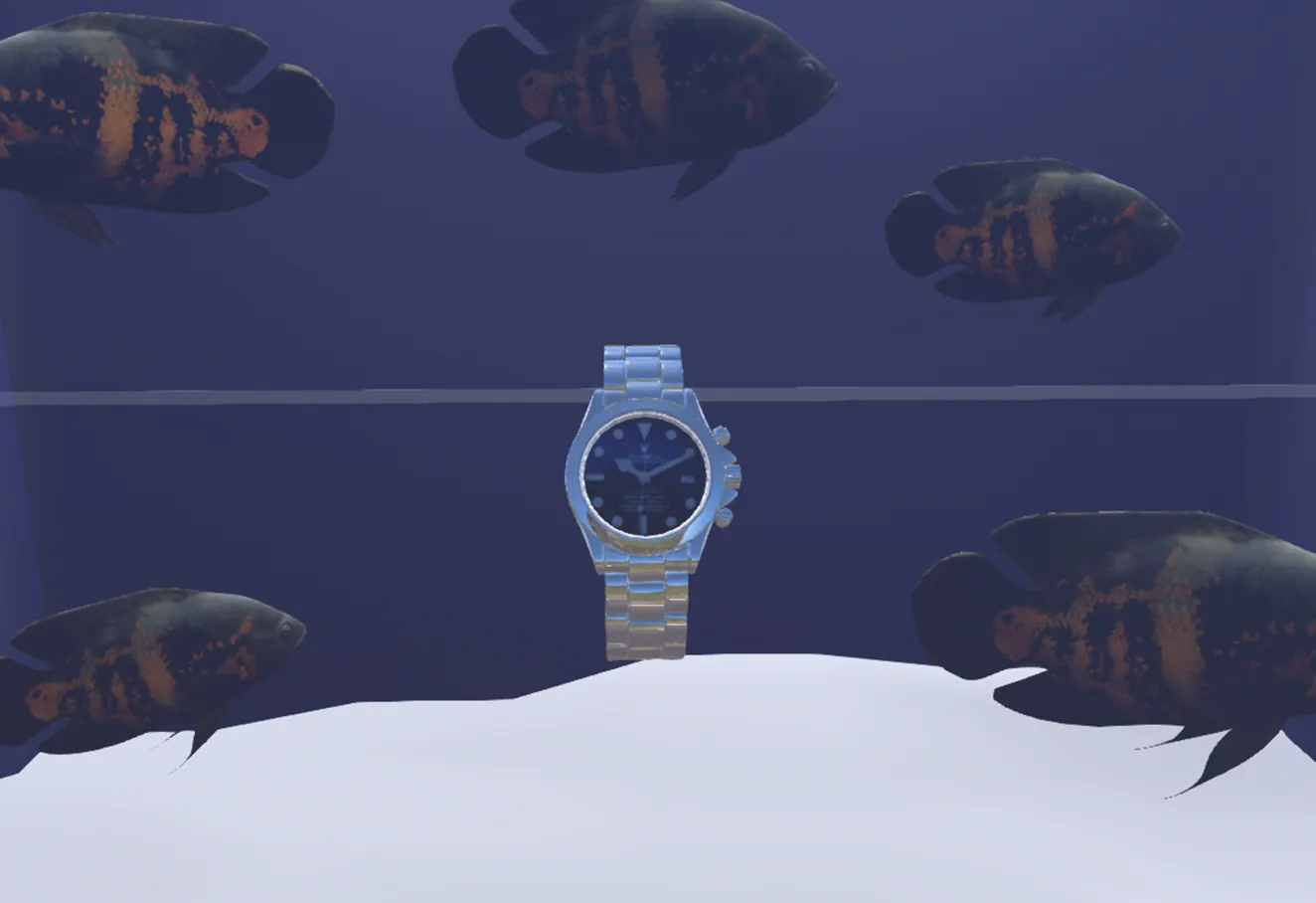
An immersive exhibition that puts each iconic watch back into the feat it was made for - visitors become part of the story, not just spectators.
Problem
Rolex enjoys huge recognition, but its watchmaking heritage remains abstract to the general public. A classic exhibition – display cases and labels – informs without creating emotion or memories.
Answer
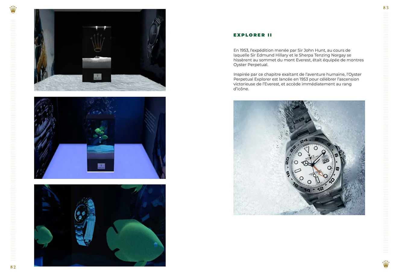
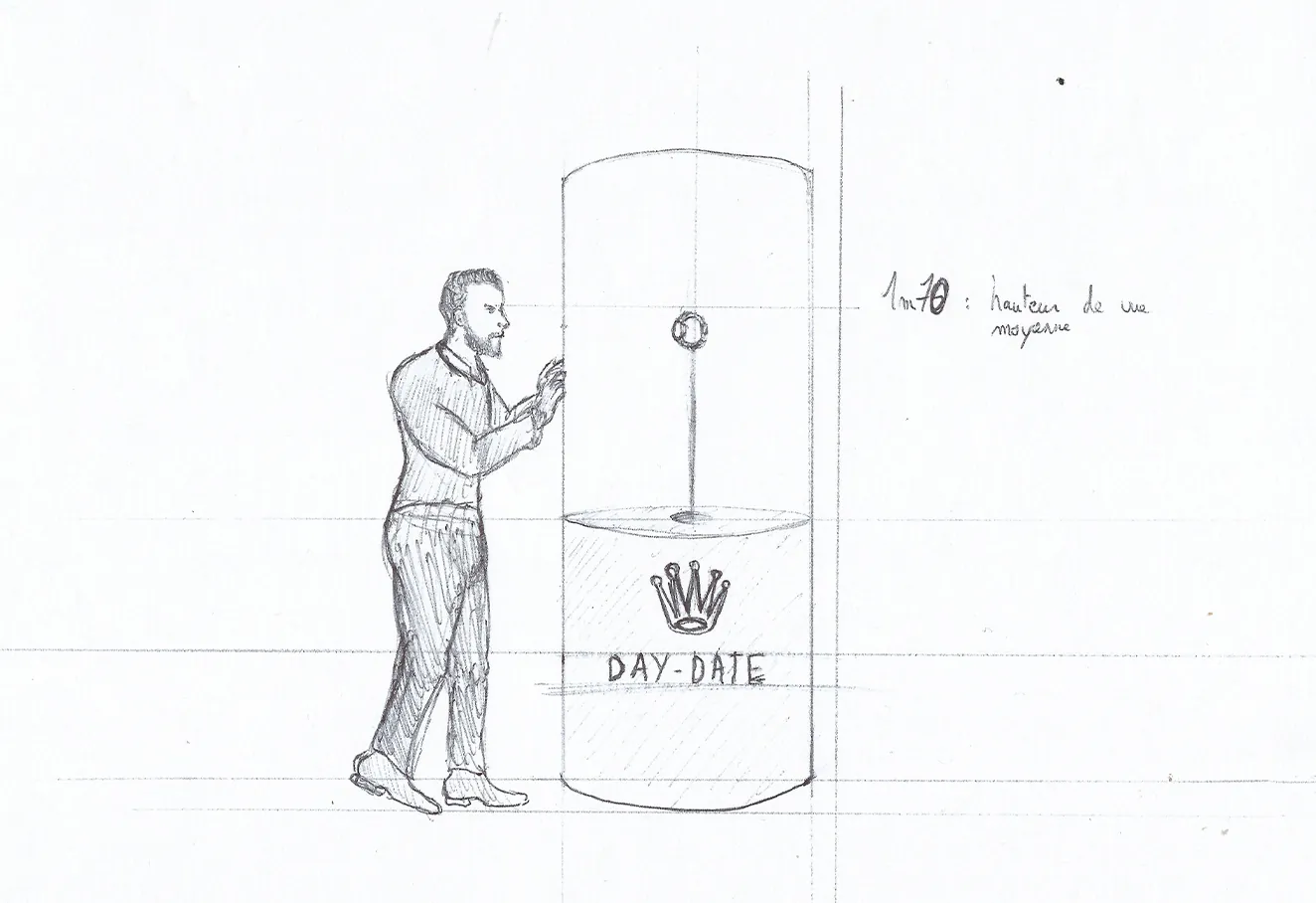
A scenographic journey that puts each legendary model back in the context of its feat (depths, altitude, exploration), with one strong interactive installation per world that makes visitors take part.
Context
The brief: design the visitor experience for a temporary exhibition of the brand’s legendary models. A broad audience, from enthusiasts to the merely curious, with one rule – no technical jargon.
- The point was not to show more watches, but to make people feel why they matter: turning a collection into a story.
Research
Before any mock-up, I scoped the subject through comparison and observation.
- Benchmark of brand exhibitions
- Exploratory interviews (enthusiasts & newcomers)
- Observing museum visitor journeys
- Review of scenography literature
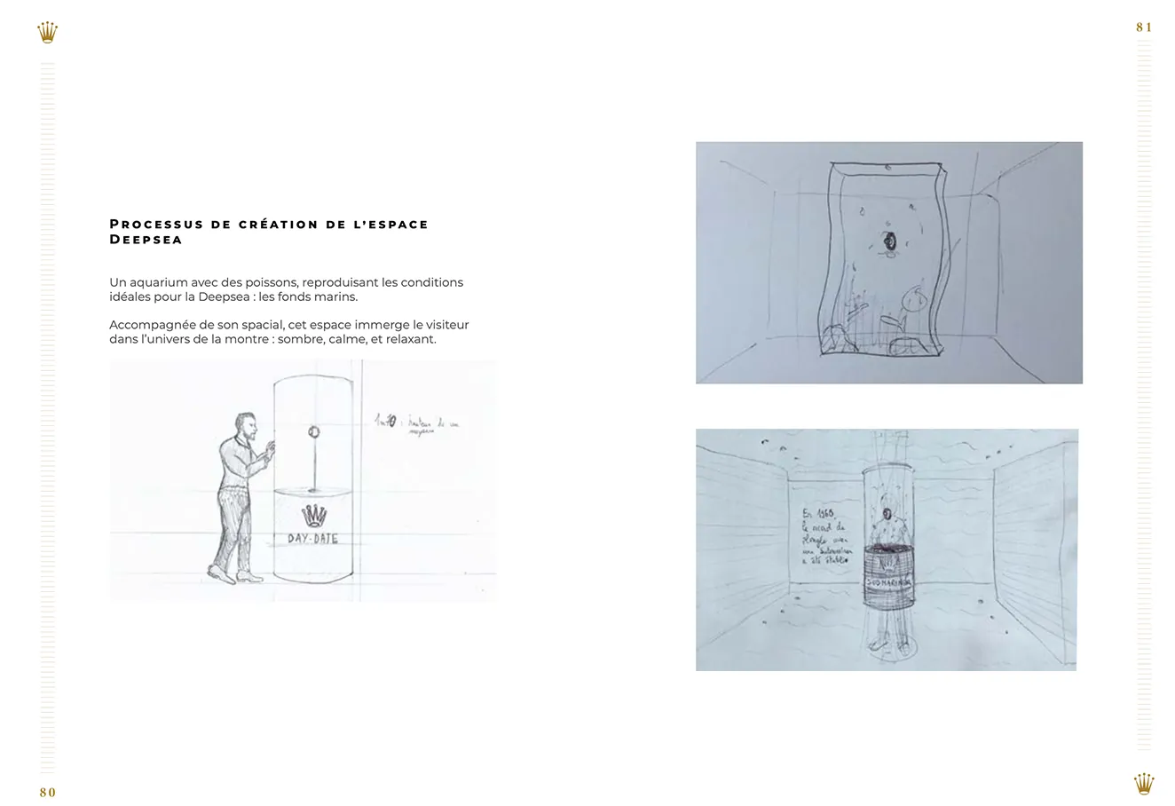
Scoping
Three visitor profiles shaped every trade-off, summed up in one guiding question.
- The enthusiast - knows the references, wants detail and something new.
- The curious visitor - comes for the experience, not the technicalities.
- The companion - tags along with someone; without a narrative thread and breathing space, you lose them.
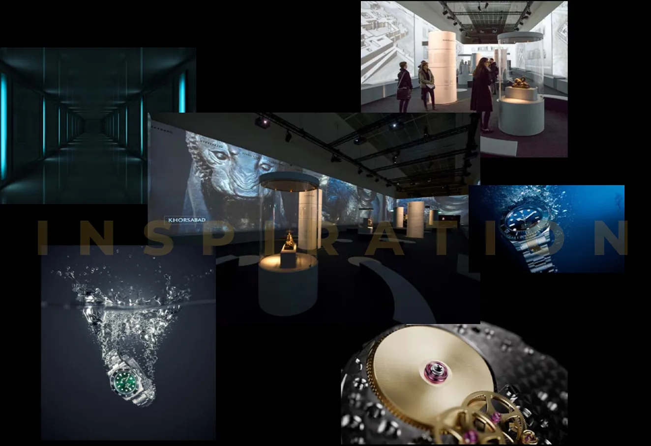
Ideation
The visit was designed as a series of worlds, each built around a frontier the brand conquered.
- Four zones, four worlds: Depths, Altitude, Exploration, Precision.
- One strong immersive installation per zone, with the rest in support so visitors aren’t overwhelmed.
- Visit scenarios tested on the floor plan: duration, fatigue, decision points.
- Signage designed to stay legible in low light.
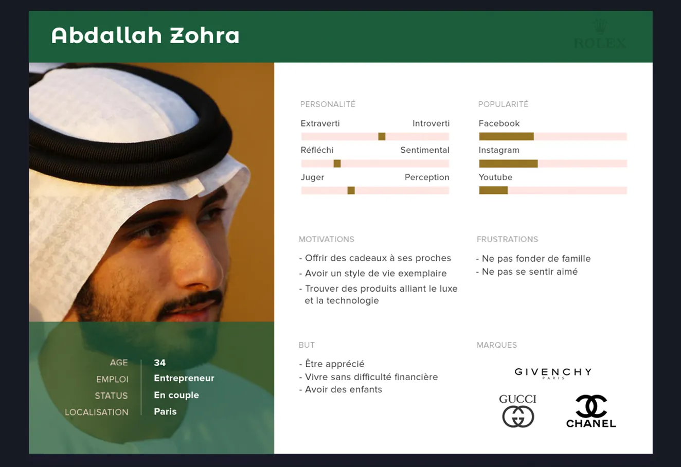
Design
The art direction plays on contrast: controlled darkness, a halo of light on the object, large and restrained typography.
- A 3-level label system: hook / essentials / going further.
- Dark palette + warm accent to draw the eye to the piece on display.
- Reusable panel templates and consistent typography throughout the exhibition.
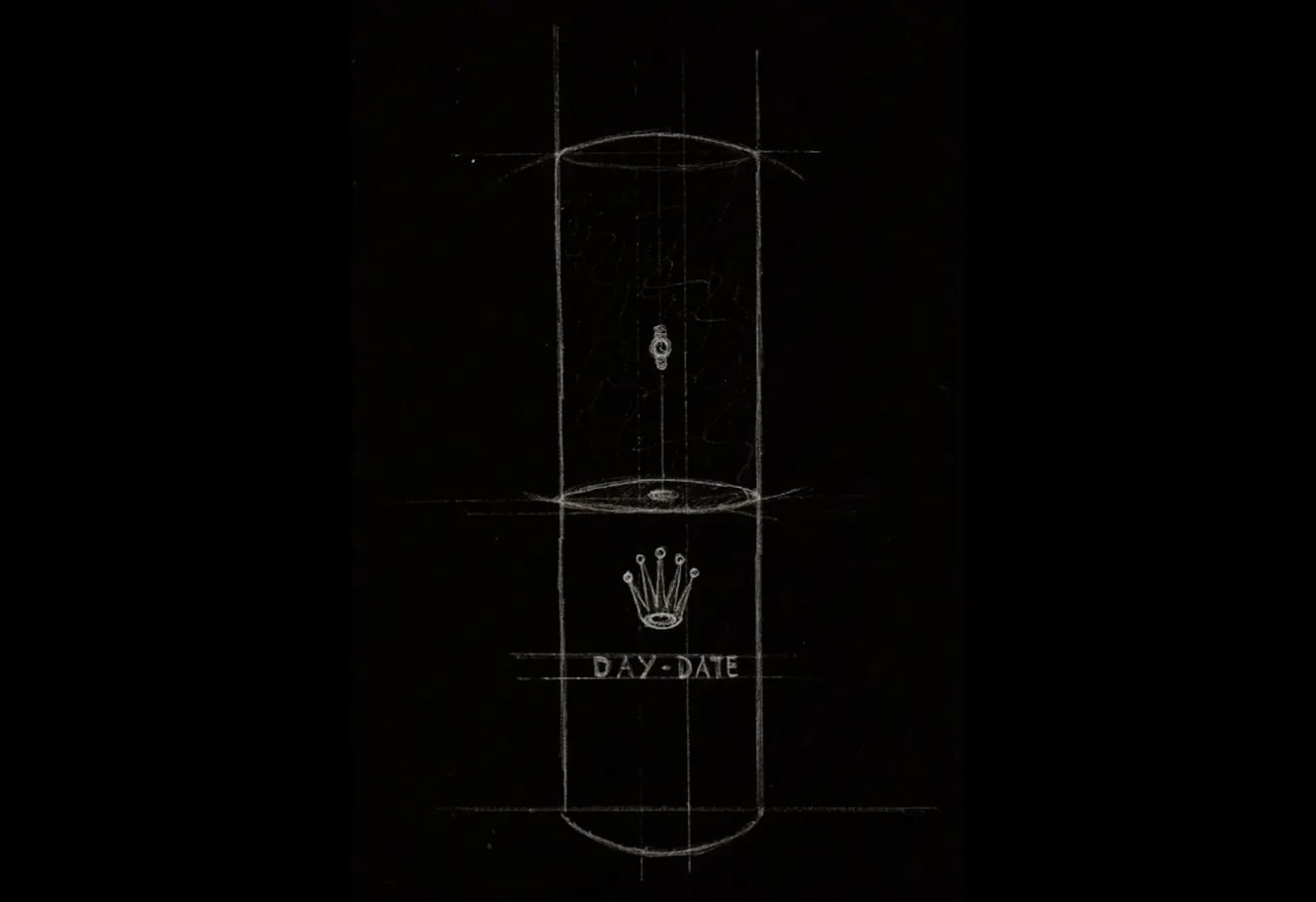
Testing & iteration
One zone was built at full scale and tested with six people from different backgrounds.
- Exhibit labels shortened and moved: the reading order was ambiguous.
- Added entry / exit markers to each zone to make progress clearer.
- Signage contrast increased after observation under real lighting conditions.
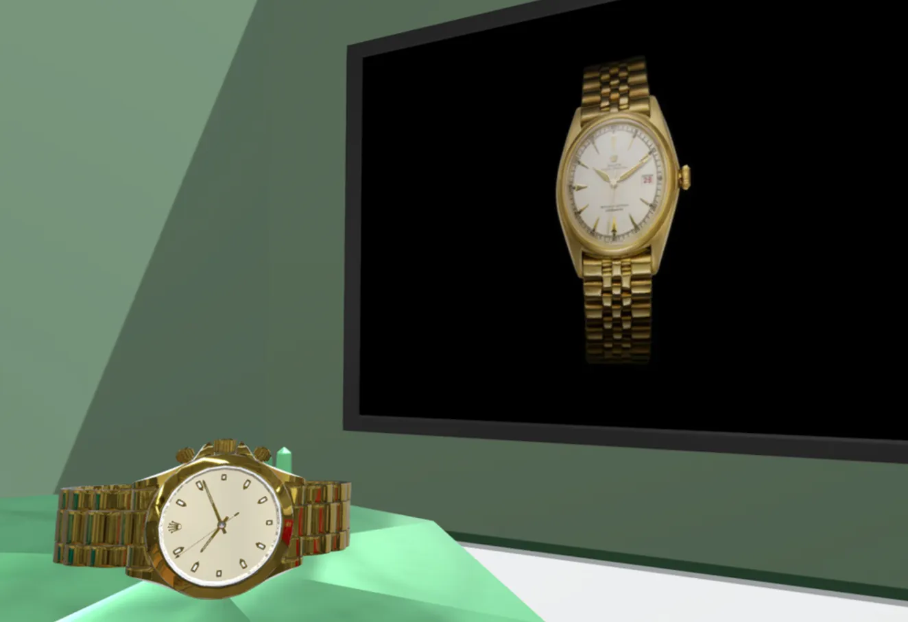
Outcome
The core idea – live the feat before talking technology – holds up: testers come out telling a story, not reciting a spec sheet.
- With more time, I would have built in accessibility (step-free route, audio version, captions on installations) from the scoping stage rather than at the end.