← WorkCase study 03 / 04Visual Identity & Mobile Application
Subscrib
An app that helps local businesses build recurring revenue through subscriptions: a hairdresser offers five cuts a month for a fixed price, a restaurant two meals.
Problem
A local business’s income depends on customers dropping in now and then. Subscriptions, common in digital, are still rare at the hairdresser’s or the restaurant: there is no simple tool to offer them, or for customers to understand them.
Answer
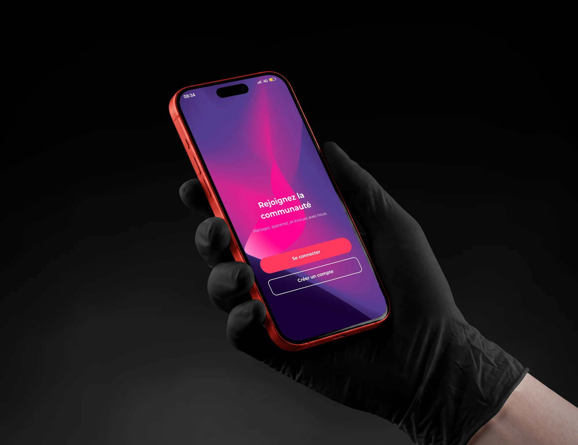
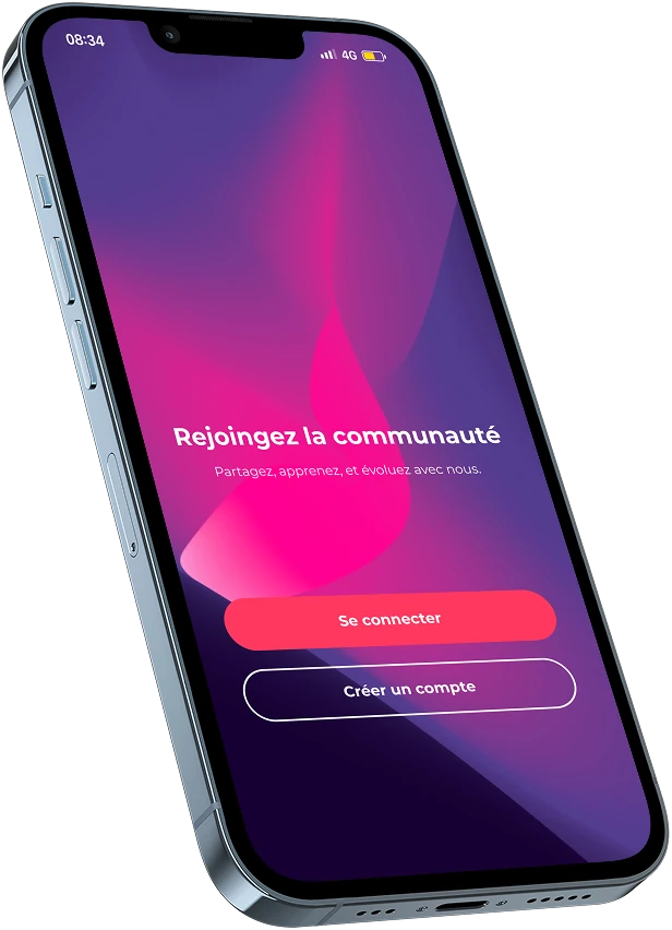
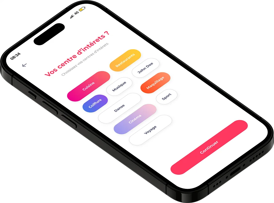
An app with two profiles, customer and business. For customers, onboarding maps their habits (interests, how often they go out), recommends a plan, then reveals the partner shops nearby.
Context
Subscrib helps local businesses earn revenue through subscriptions. For a fixed price, customers get a set number of services each month: five haircuts at their hairdresser’s, two meals at their restaurant.
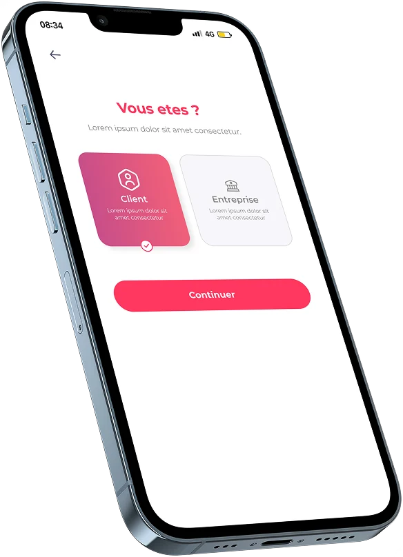
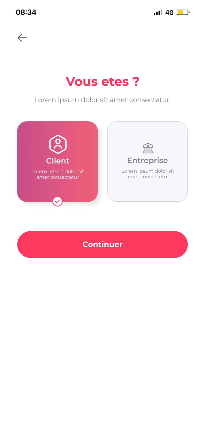
- Two audiences in one app: the customer who subscribes and the business that offers plans - the choice is made at sign-up (“You are: Customer / Business”).
Subscrib signature
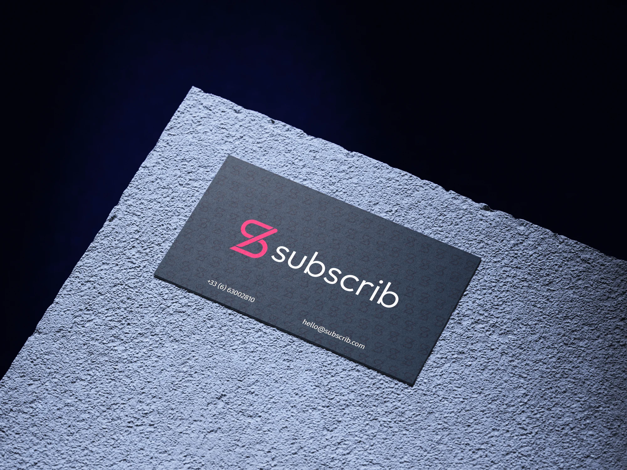
A monogram S, a frank pink and a night blue install an identity that accompanies the application on several supports.
- The card combines the symbol and brand name in a sober composition.
- The repetition of the symbol forms a pattern, presented here on textile.


One idea, two formats
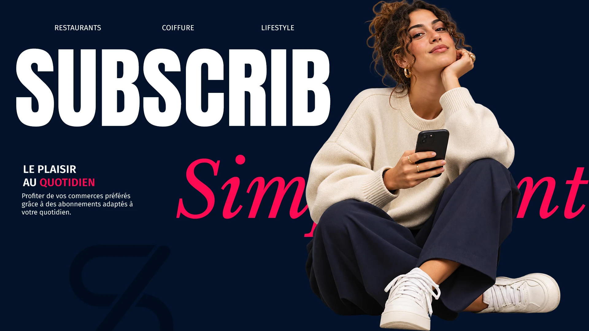
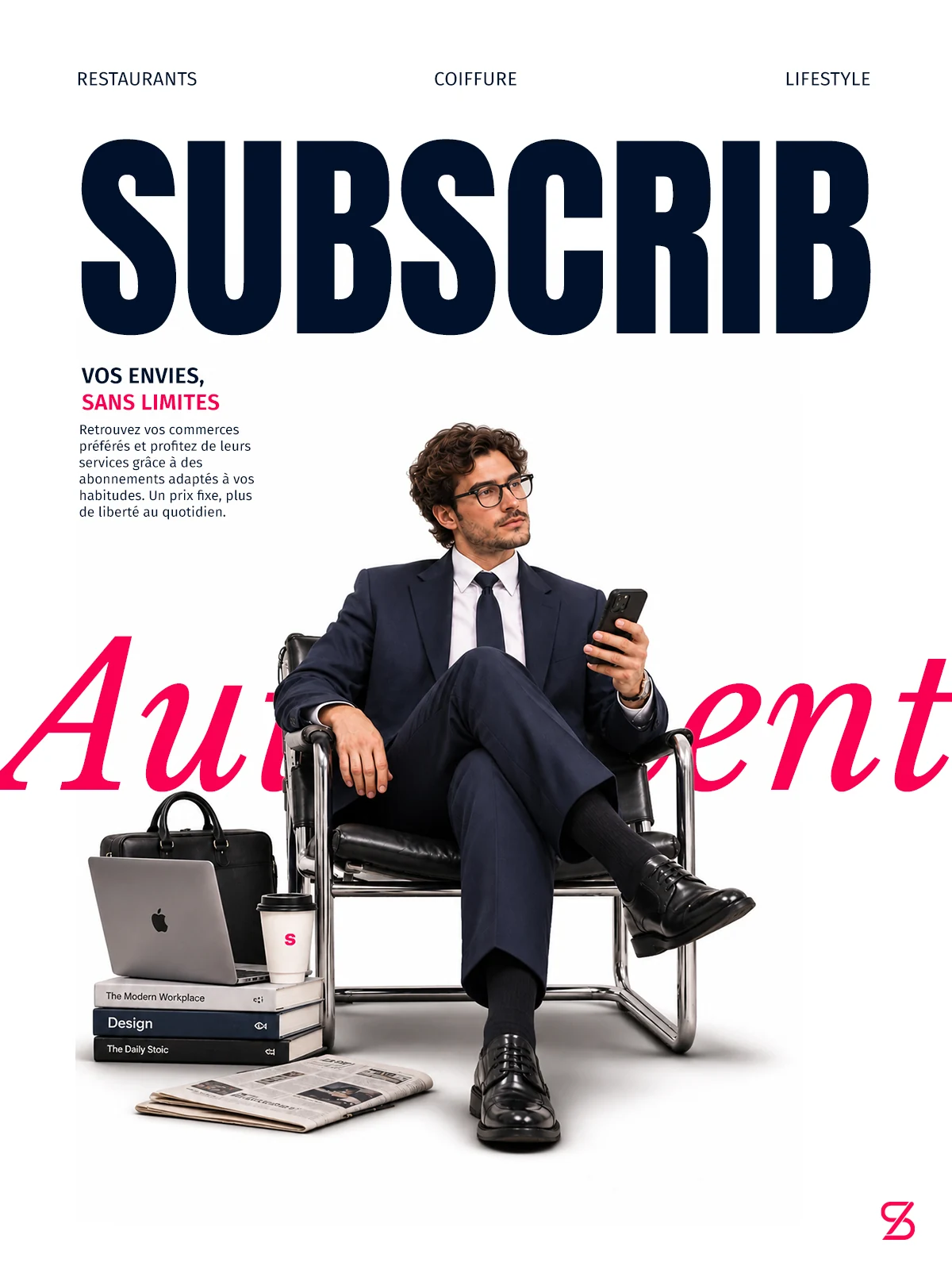
The posters come in two compositions: a horizontal version on a dark background and a vertical version on a light background.
- The name in large format gives a common reference to both creations.
- Photography and objects evoke everyday usage around shops and services.
- The mockups link the campaign to the app entry.
Career
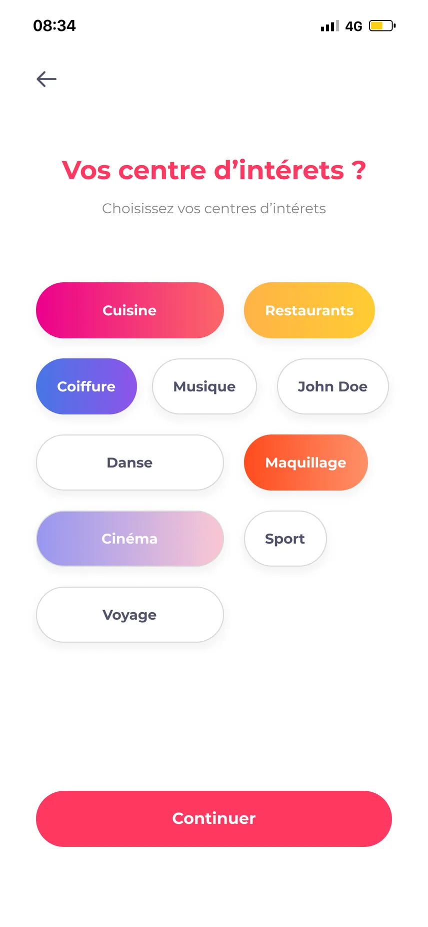
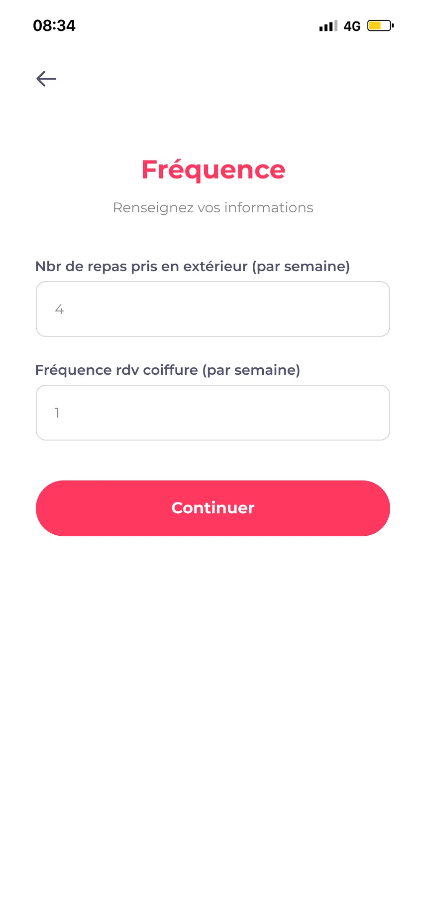
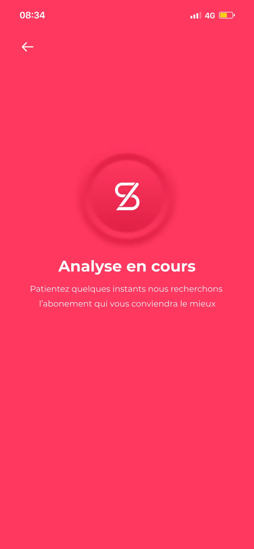
The customer journey leads to the right plan without reading a price table.
- Welcome → Sign-up → Interests → Frequency → Analysis → Recommended plan.
- Frequency is asked in concrete terms: meals eaten out, hair appointments per week.
- An “Analysis in progress” screen bridges the answers and the recommendation.
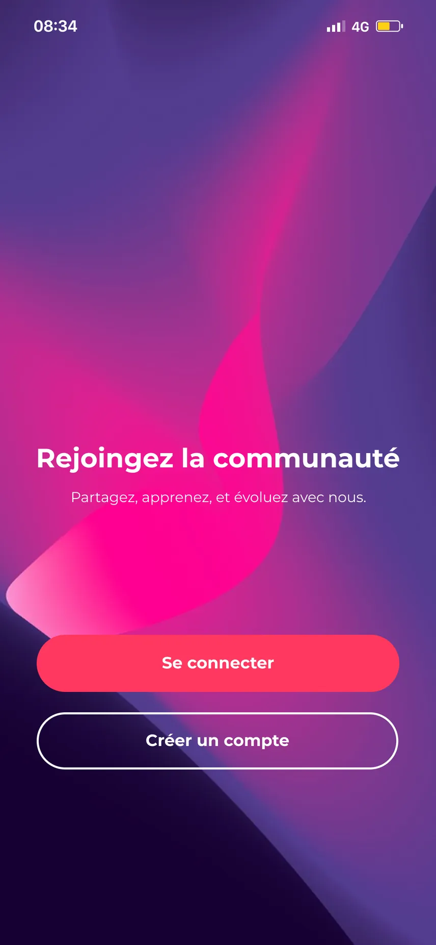
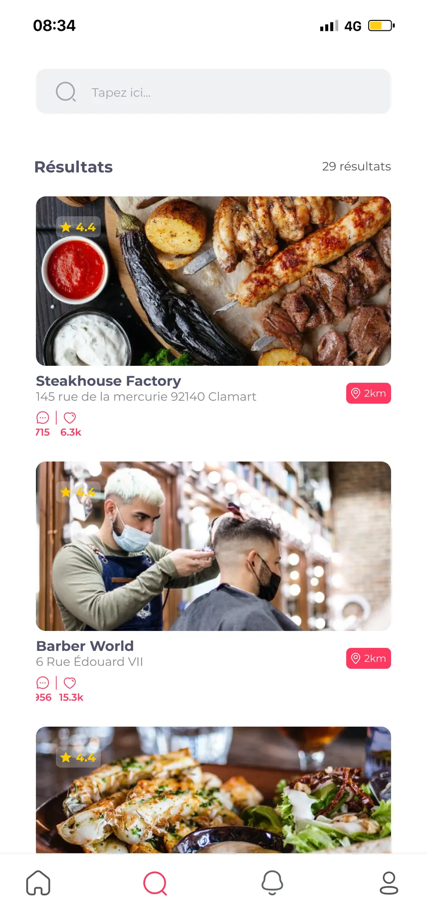
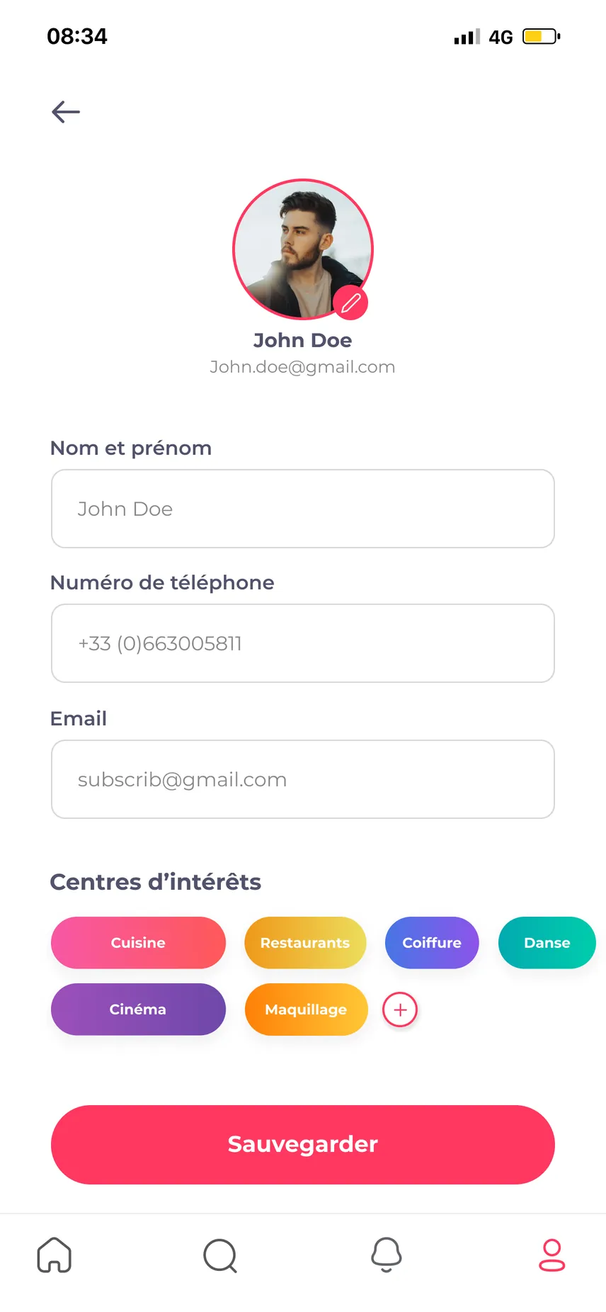
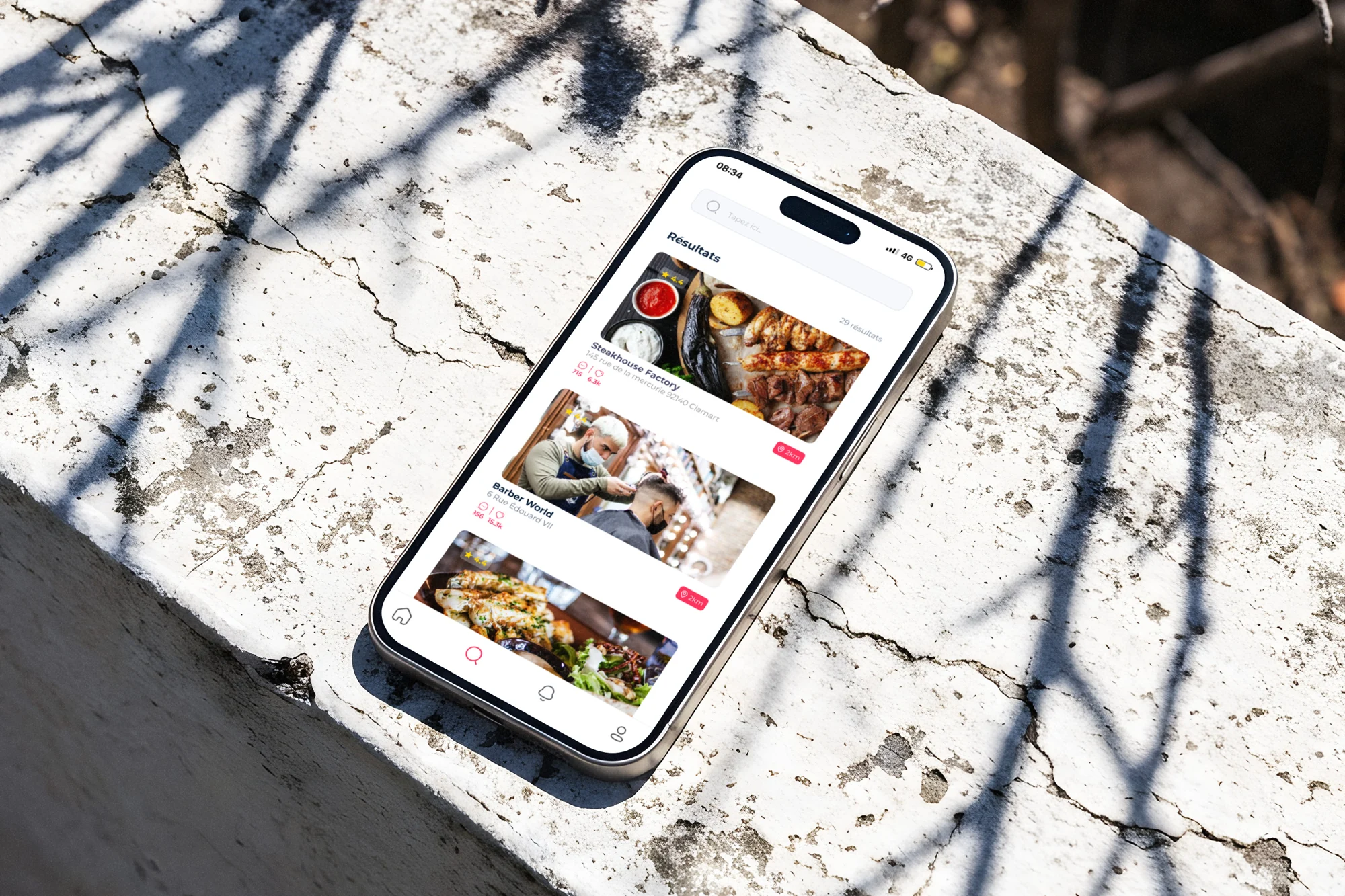
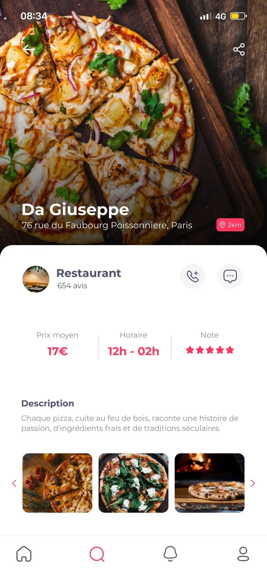
- Only then: home, search, shop pages, profile and settings.
Wireframes
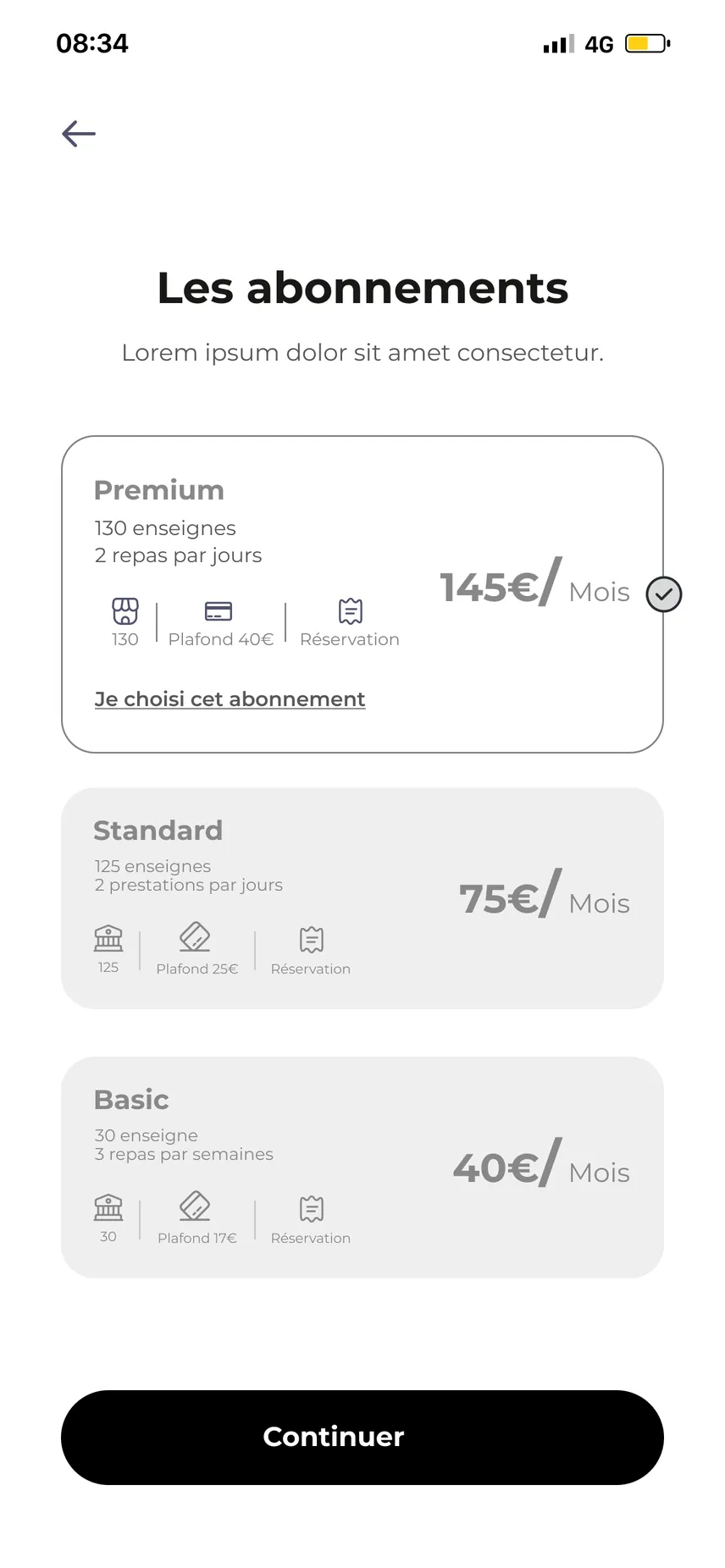
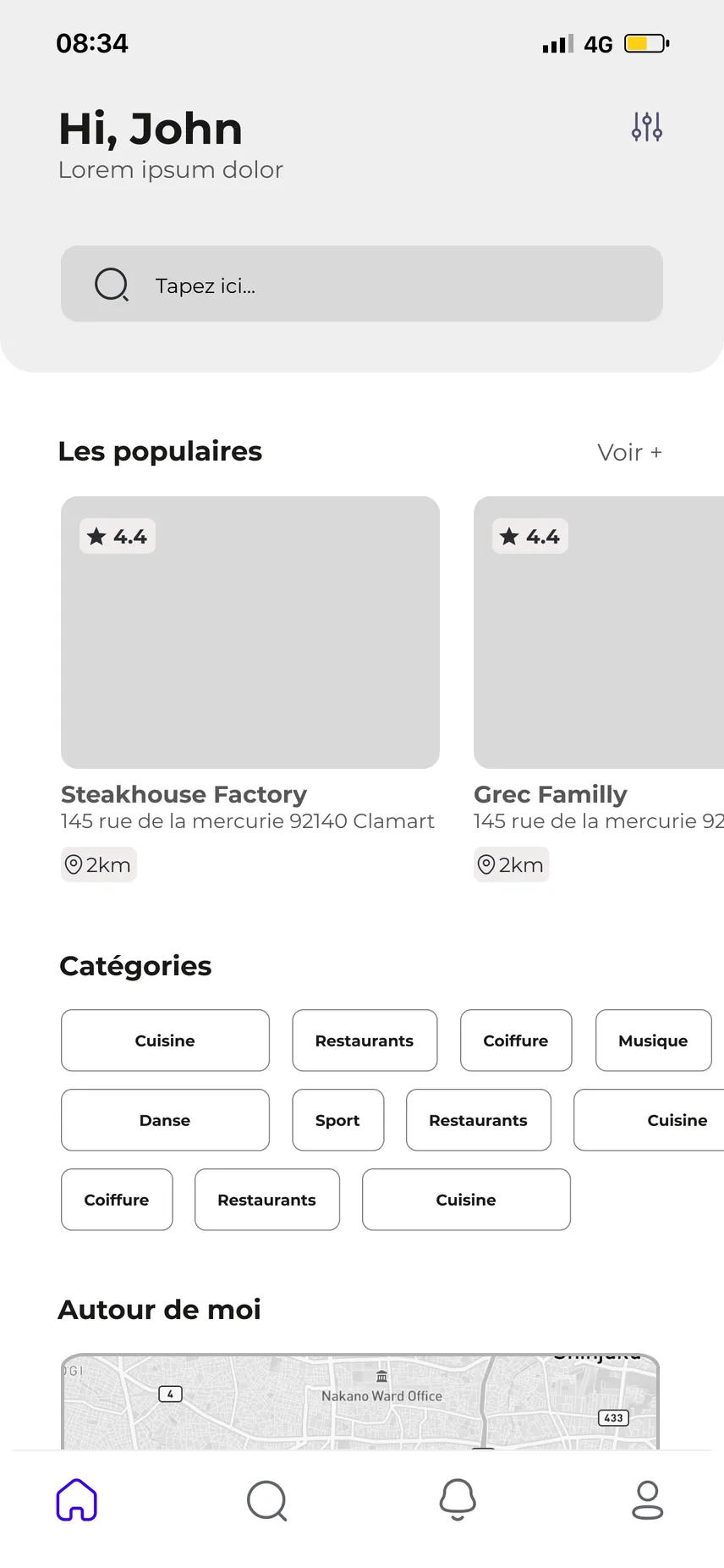
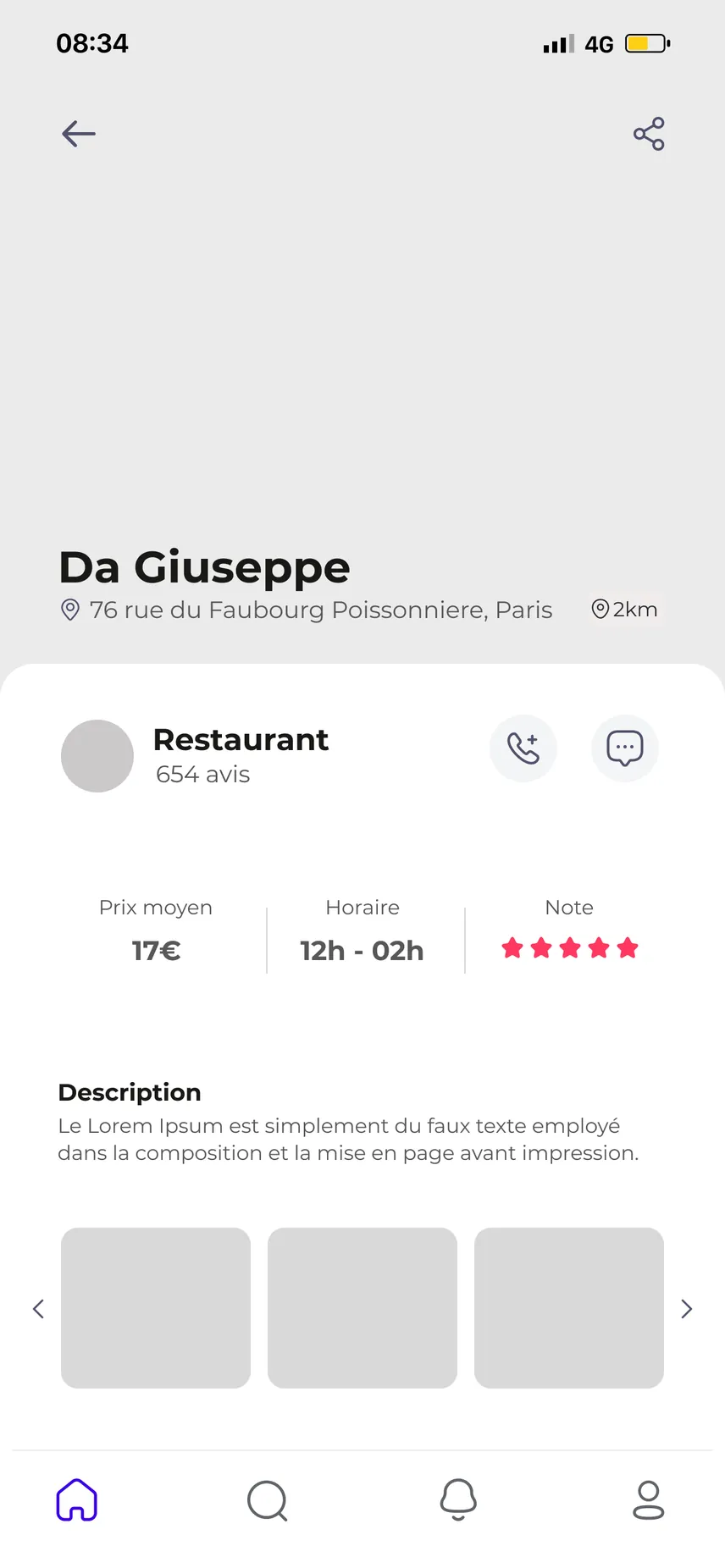
The whole journey was first laid out in low fidelity, in black and white, to validate the structure before adding colour.
- Sixteen wireframed screens, from launch screen to settings.
- The wireframe hierarchy carries through to the mock-ups: only colour, photography and typography are added.
The plans
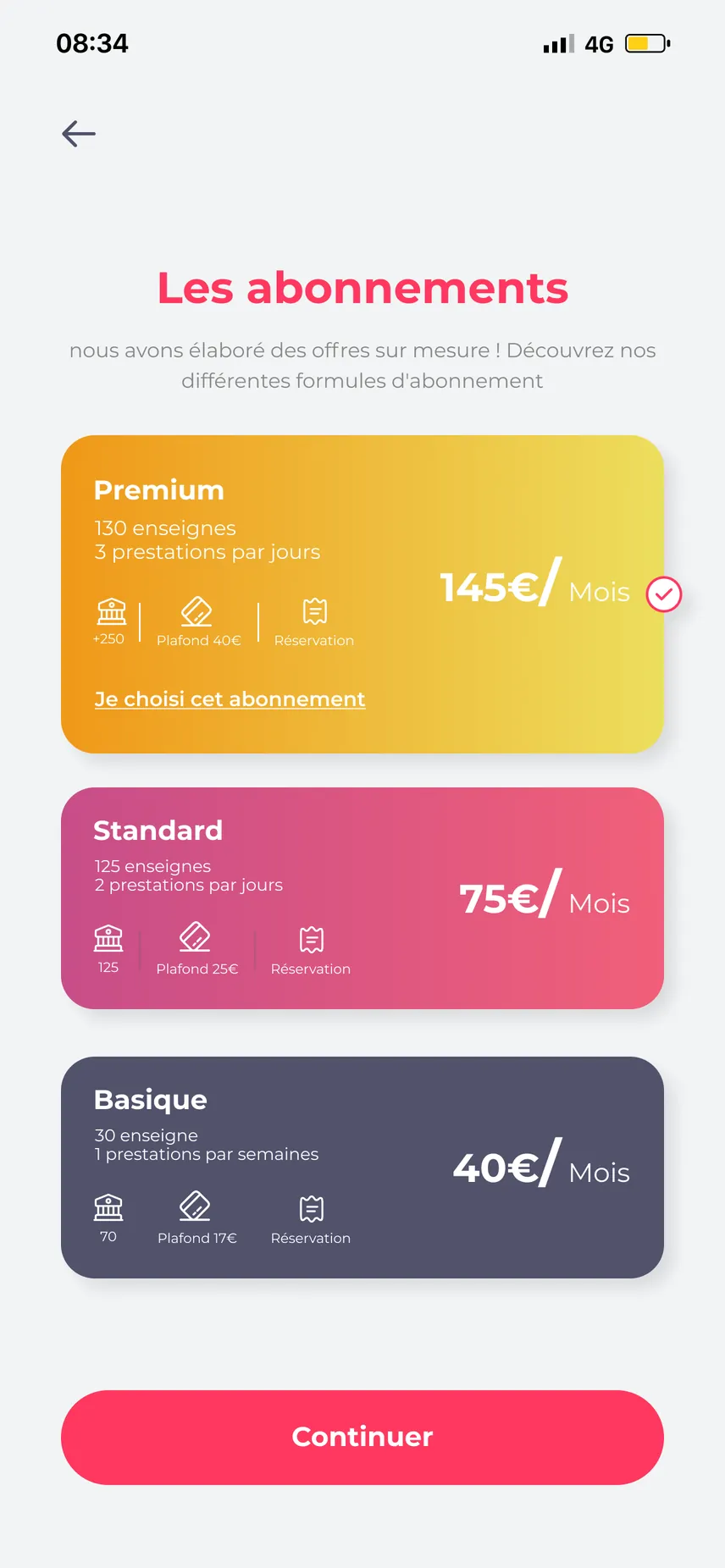
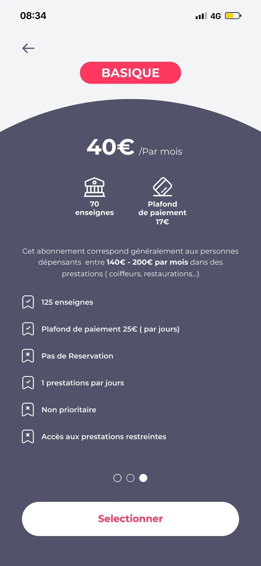
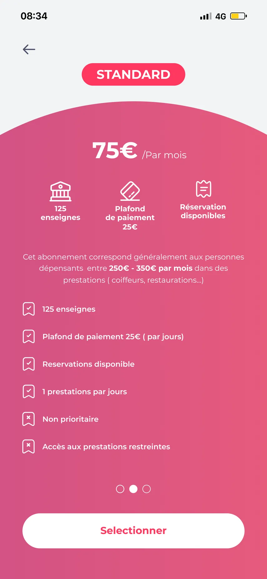
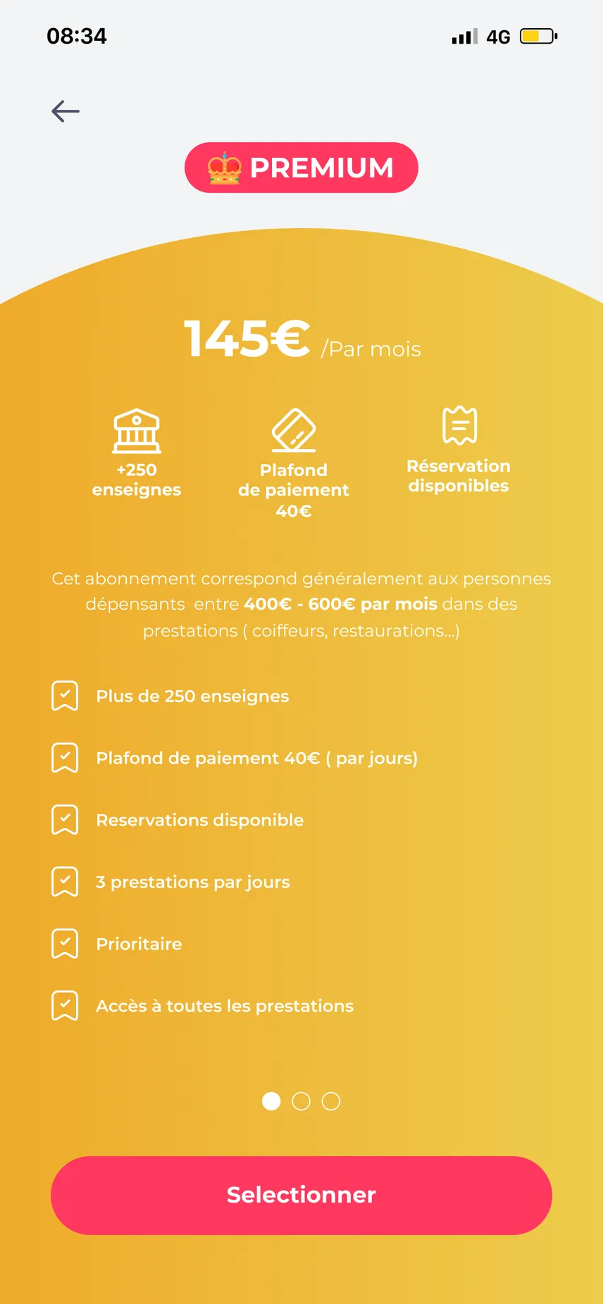
Three subscriptions - Basic €40, Standard €75, Premium €145 per month - shown twice: side by side, then in detail.
- Each plan has its own colour (slate, pink, gold), so you recognise it from one screen to the next.
- Each detail screen shows the monthly spending profile the plan is designed for.
- What is included and excluded is listed line by line: shops, payment cap, bookings, services per day, priority.
Design
A direct identity: an S monogram drawn in a single stroke, a bold pink for actions, midnight blue for the brand.
- Pink (#FF385F) is reserved for actions and active states; midnight blue (#041930) carries the logo and launch screen.
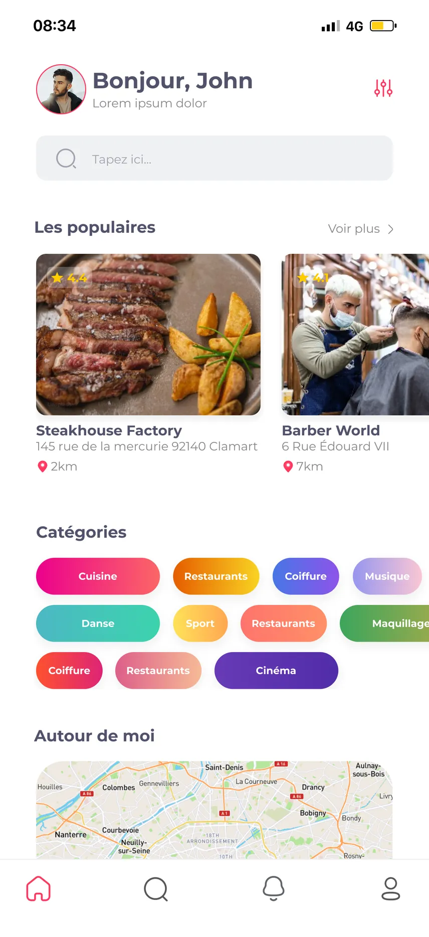
- Colour-coded category chips, real photos of shops, “near me” geolocation.
- Four-tab navigation bar: home, search, notifications, profile.