← WorkCase study 02 / 04Visual identity, campaign & app
MeetEat
Share a meal in someone’s home, anywhere in the world. An identity and an app that turn cooking into a cultural exchange between hosts and guests.
Problem
Home-dining platforms remove the price barrier, but not the trust barrier: people hesitate to dine at a stranger’s home – and even more to open their own table.
Answer
A warm world carried from poster to app: faces, direct messages and a recognisable pink. In the mobile journey, profiles, reviews and practical details make the meeting feel real.
A brand of encounters
MeetEat puts the kitchen at the service of the meeting. The logotype, photographs and illustrations give this idea a common expression, from first contact to reservation.
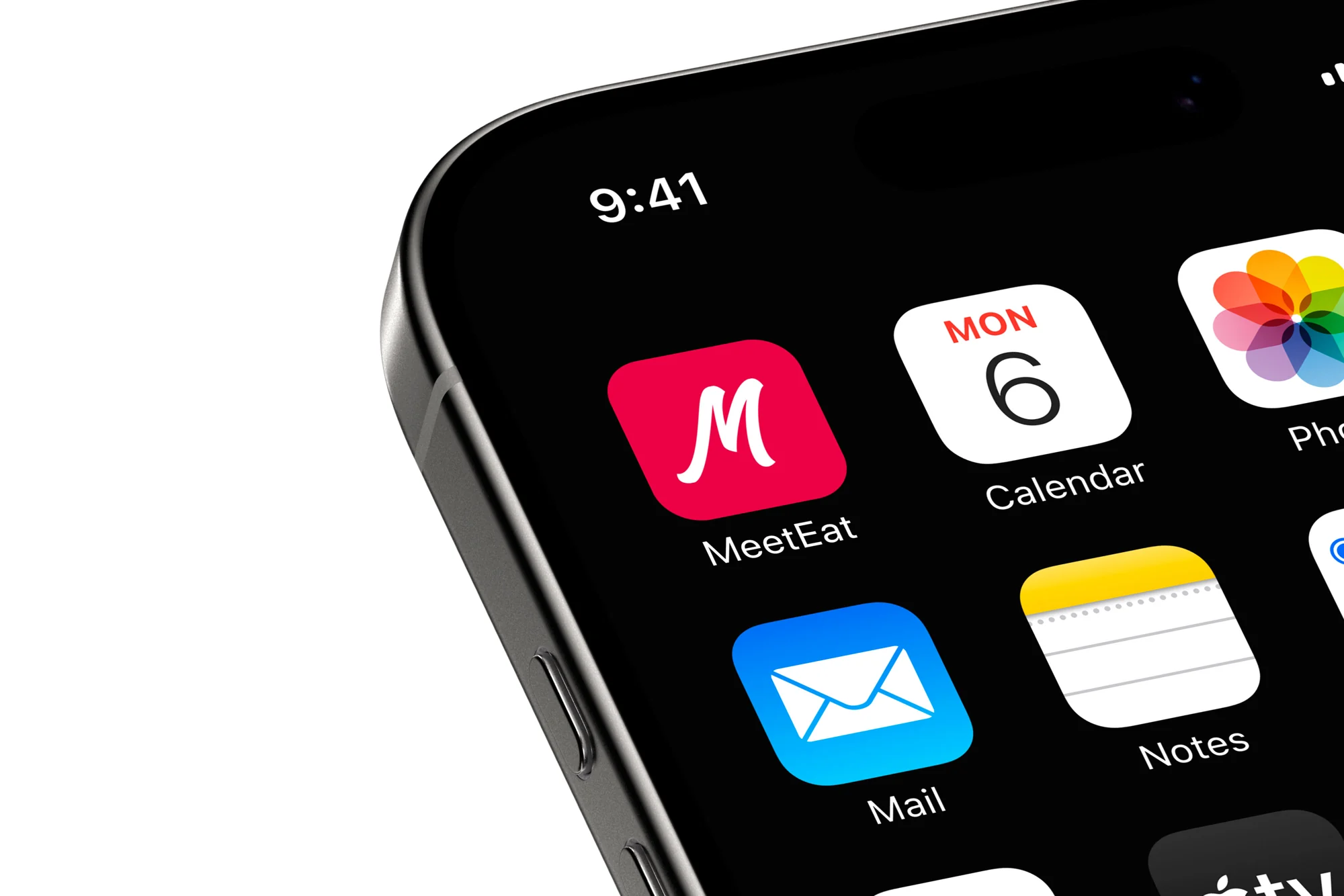
- The manuscript logotype brings an expressive signature, taken in monogram for the application icon.
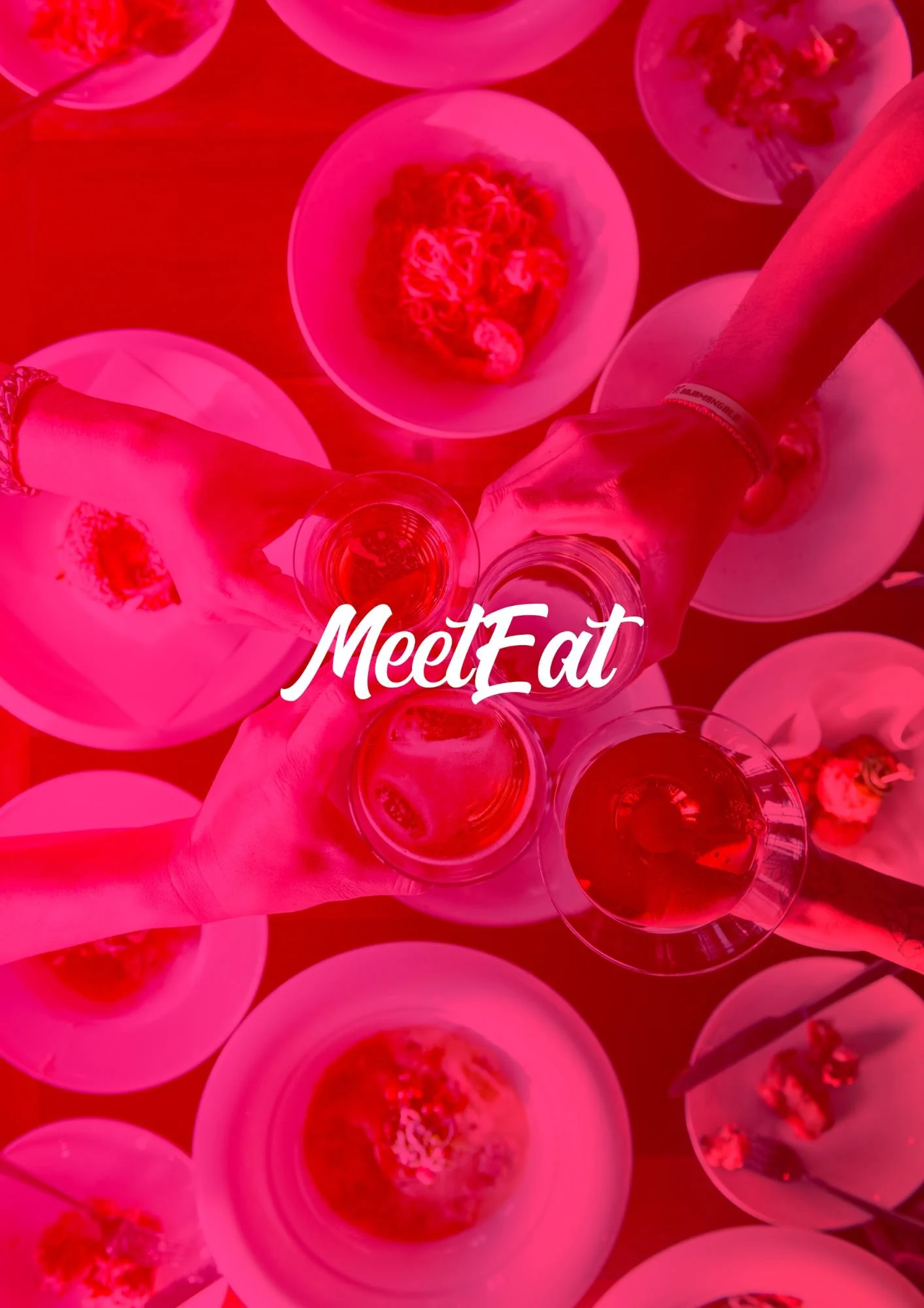
- Meal scenes and faces make the user-friendliness clear before presenting the features.
A language that is available
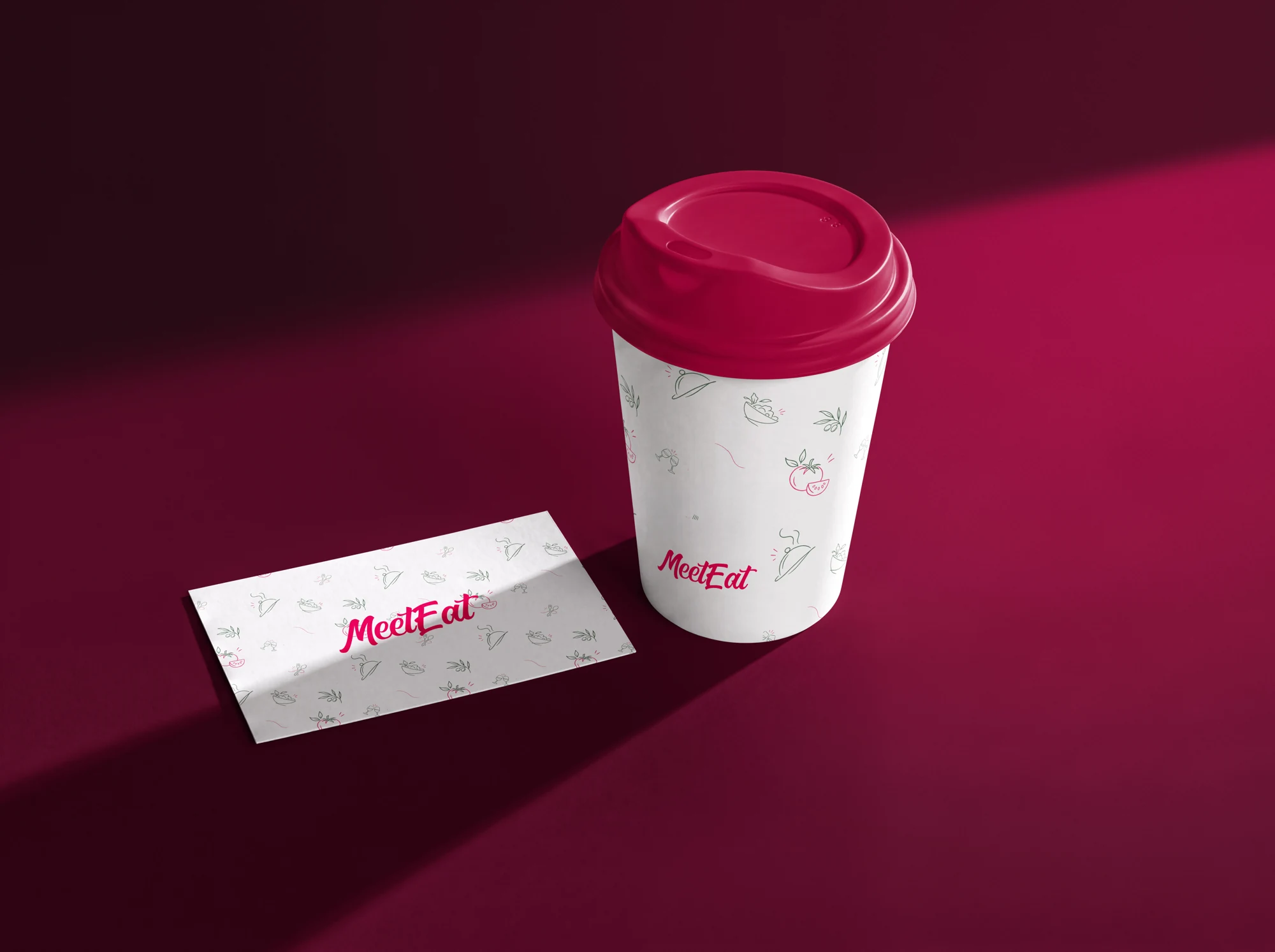
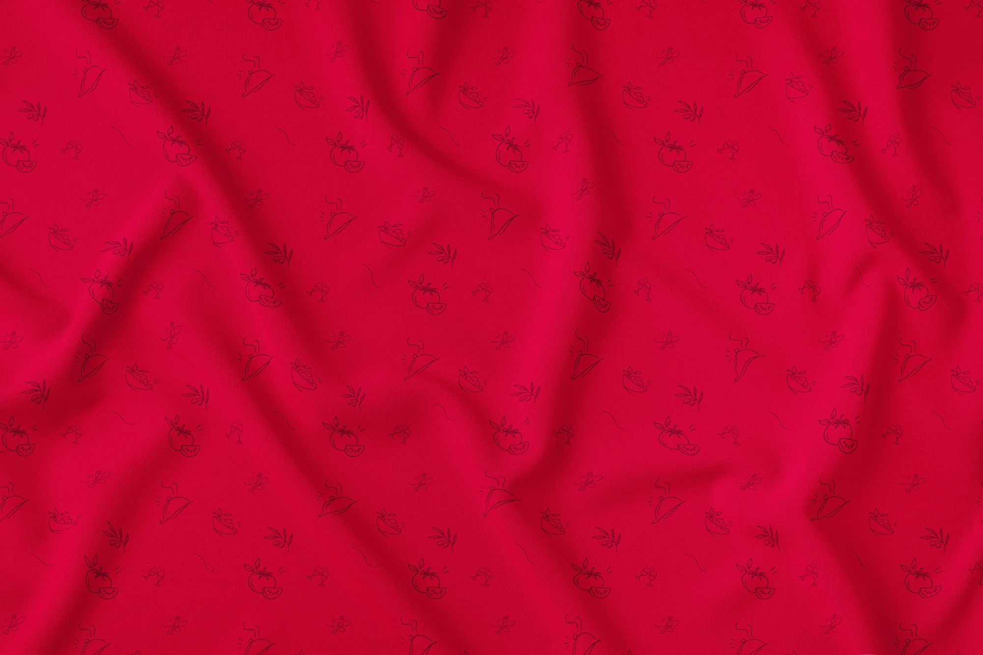
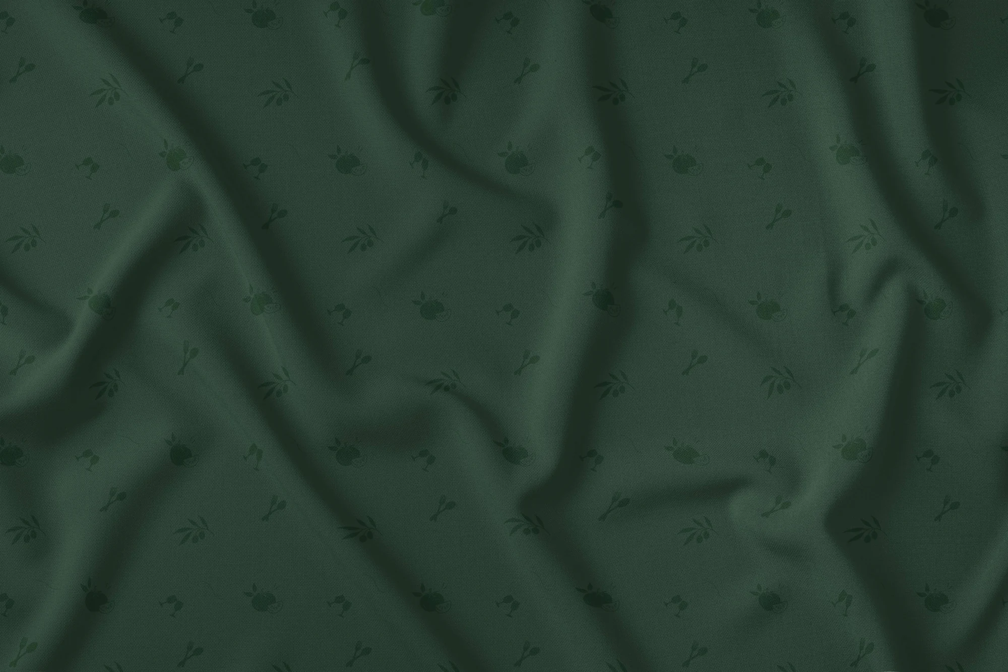
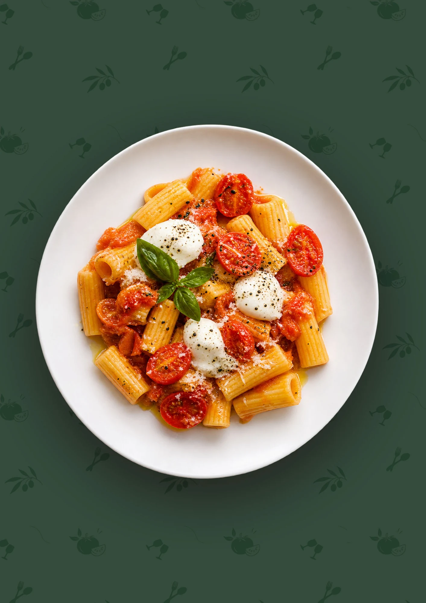
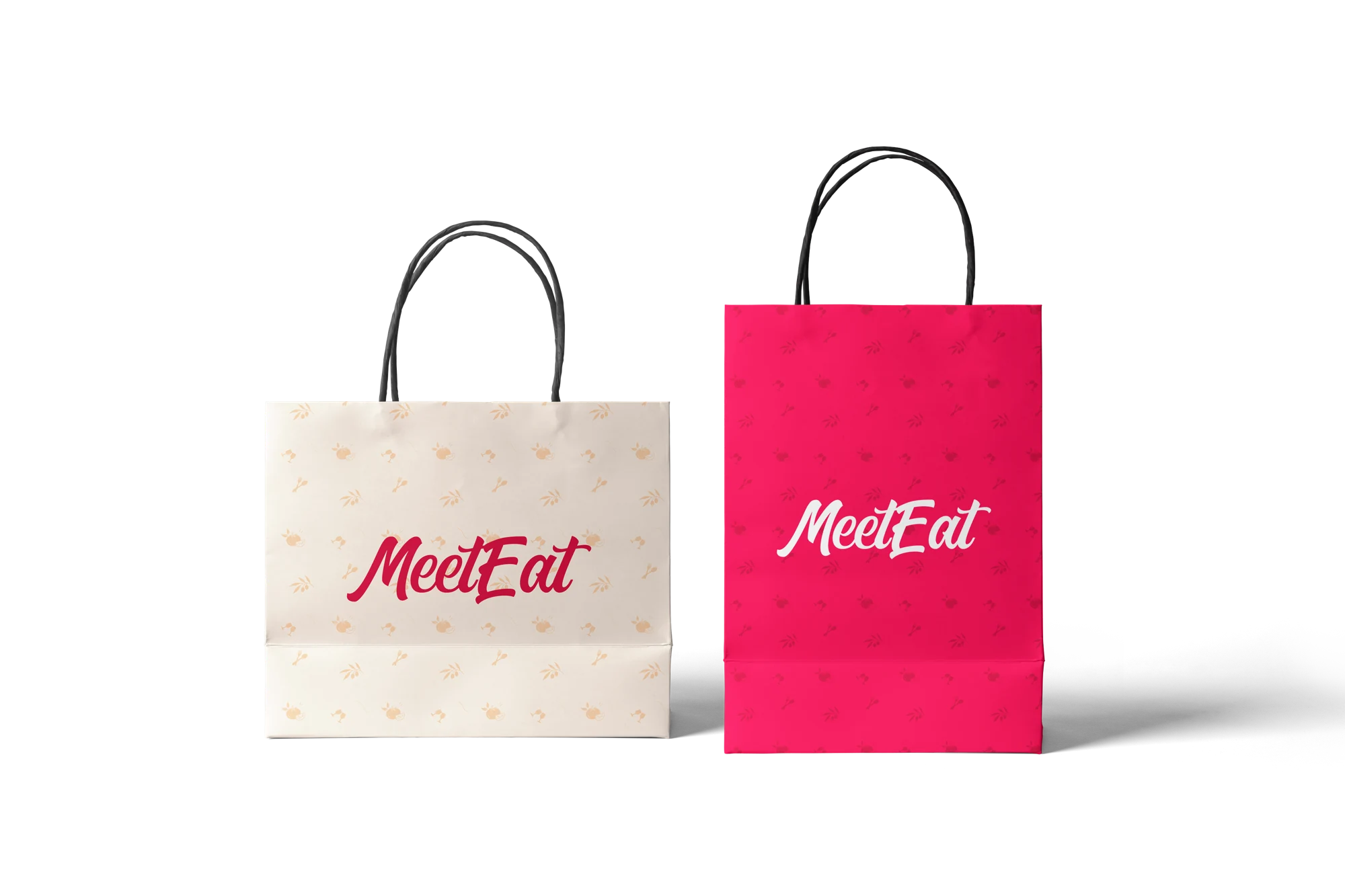
Cutlery, dishes and an illustrated line form a recognizable pattern. The pink and green versions allow to vary the compositions while keeping the same vocabulary.
- The rose takes back the color of the application and campaign messages.
- Green accompanies the culinary compositions and brings another tone to the brand.
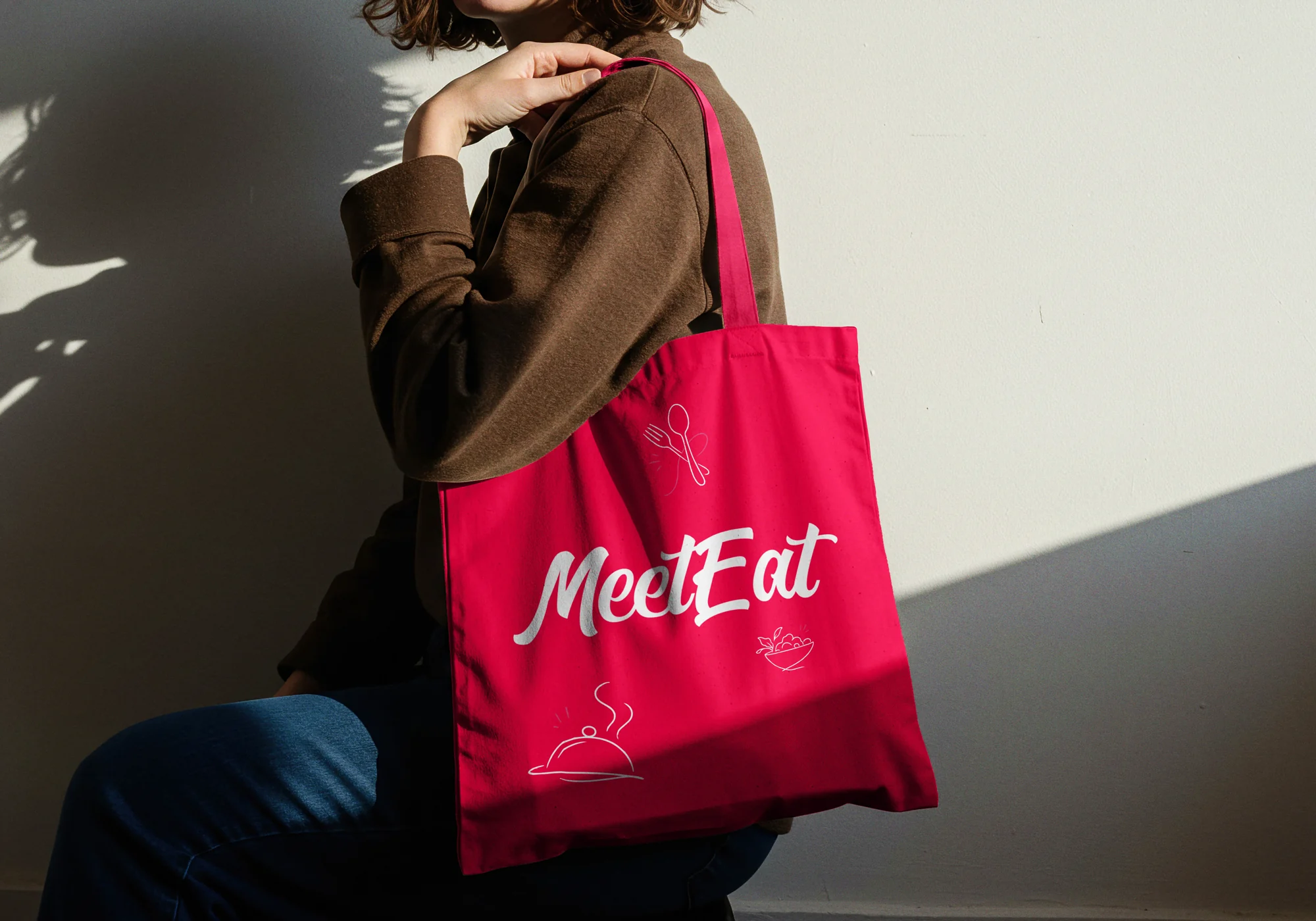
- Textile applications show the transition from flat to material.

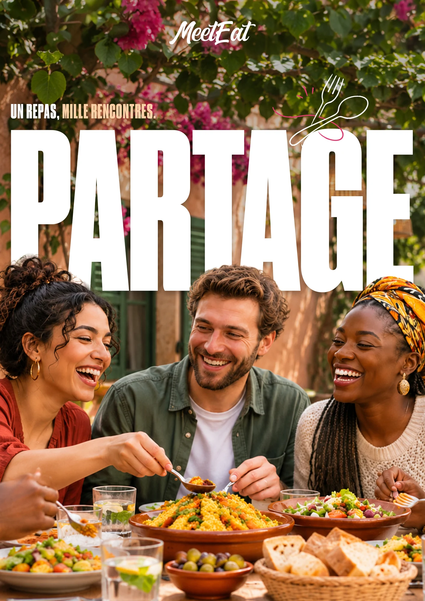
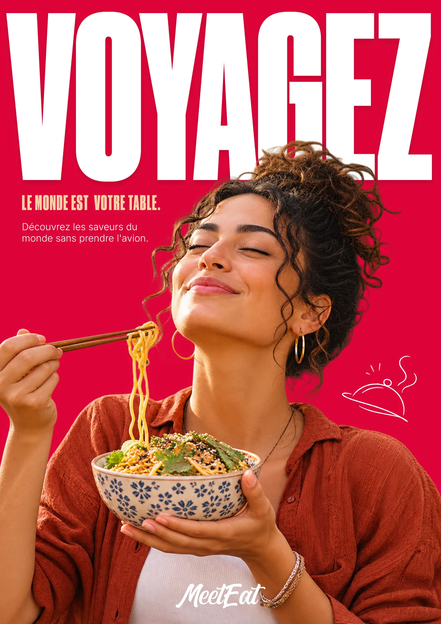
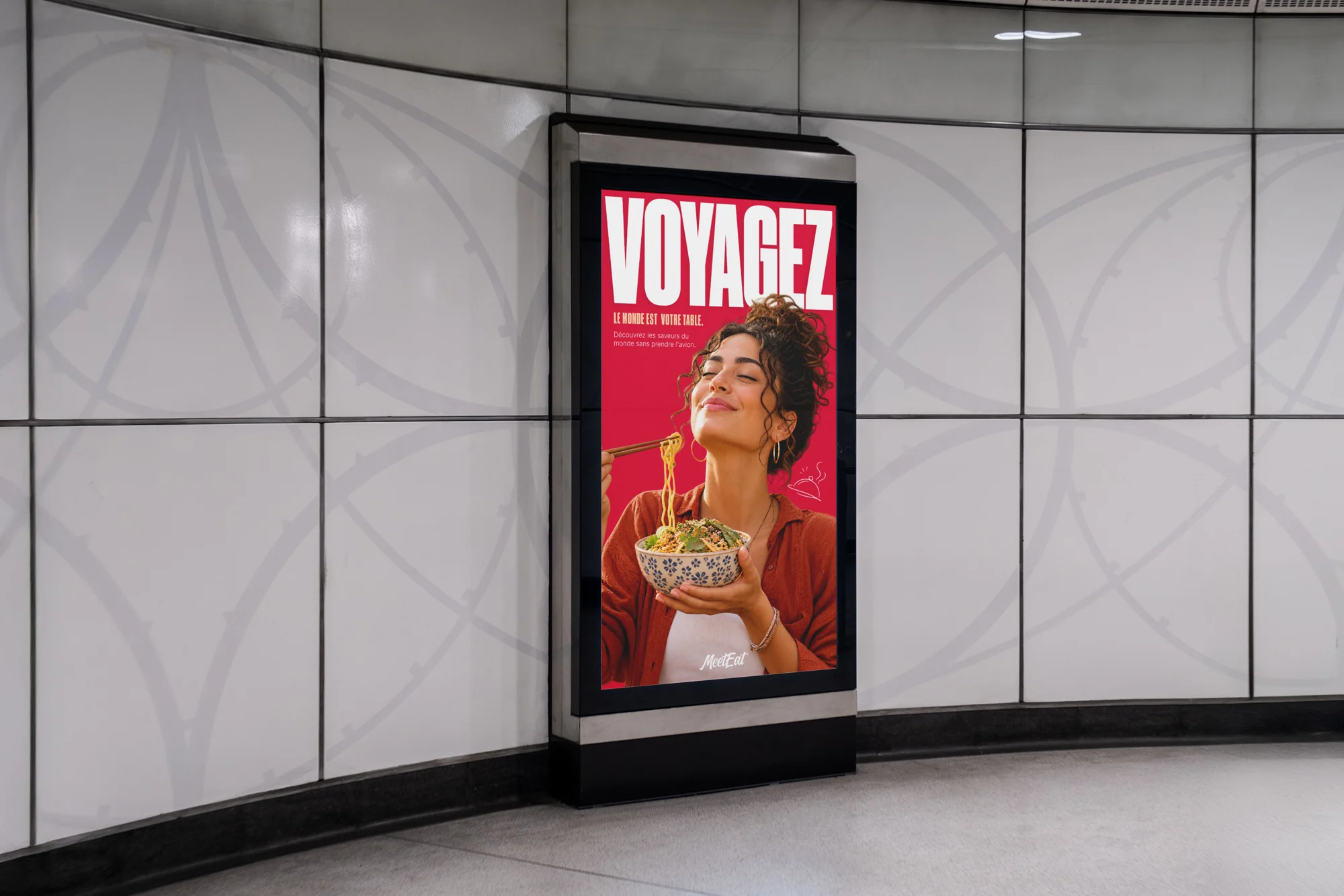
Share. Travel.
Two complementary messages tell MeetEat: "Share" presents a friendly moment; "Travel" invites you to discover other cuisines.
- Condensed typography gives an immediate grip on both creations.
- The flat compositions allow to read the details; the situation shows the poster in a public space.
The mark off the screen
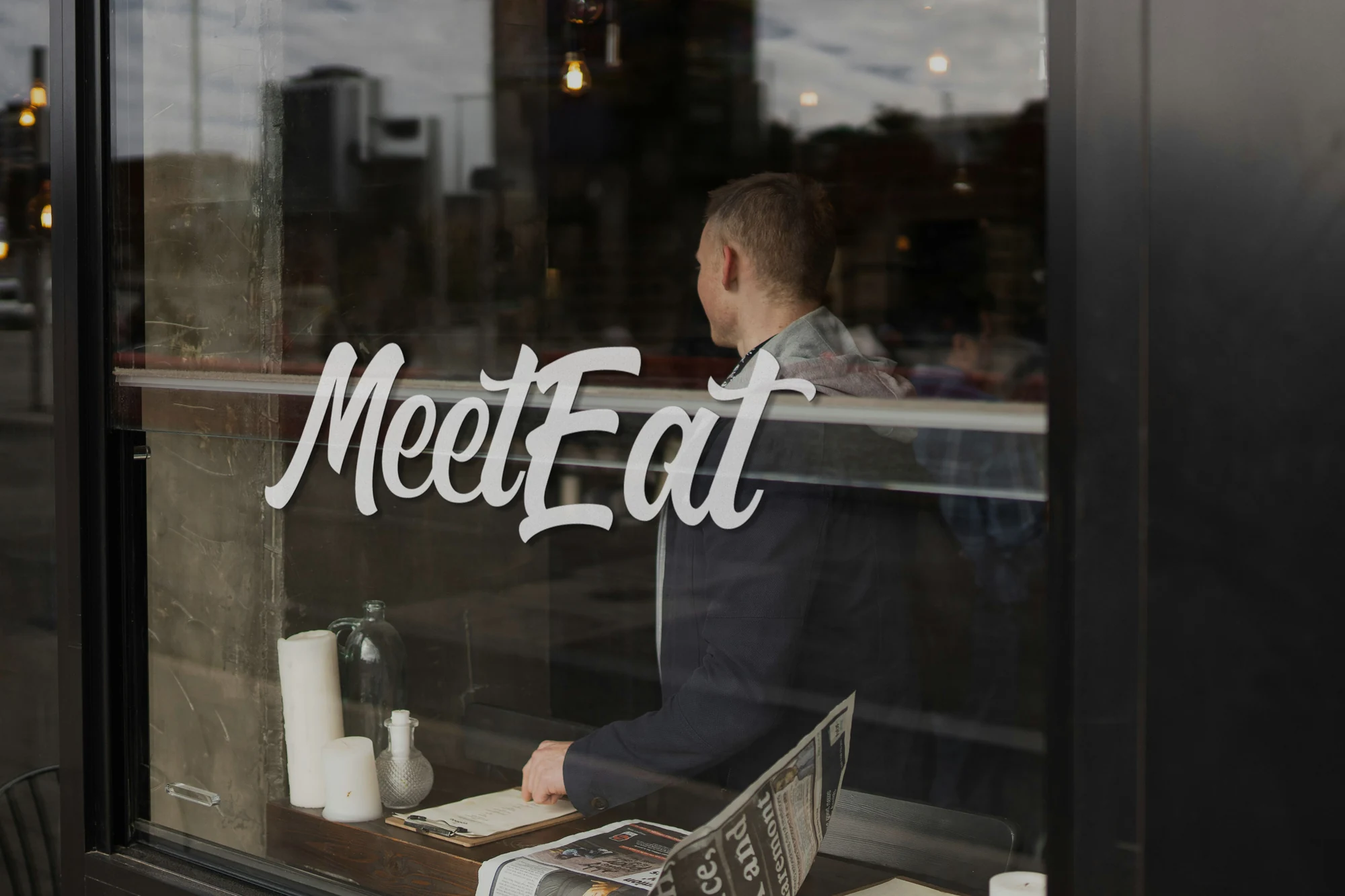
Bags, textiles, cups and windows extend the identity beyond the application. These situations show how the signature and the motives behave on different scales.
- The bags decline the same pattern on cream and pink bottoms.
- The tote bag combines the logotype and culinary illustrations.
- The window uses a white signature to remain legible in its environment.
A campaign on networks
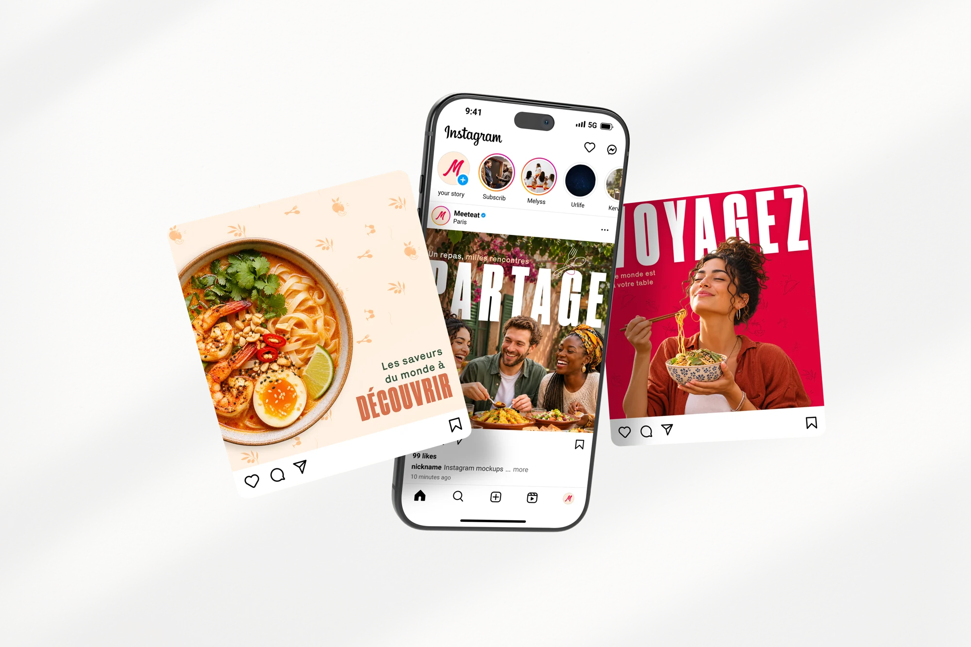
Messages and graphic codes also appear in social publications. The profile, creations and mobile display are combined in the same situation.
- Pink, culinary photography and great typography link publications to posters.
- The different formats remain recognizable as elements of the same campaign.
From meeting to eating
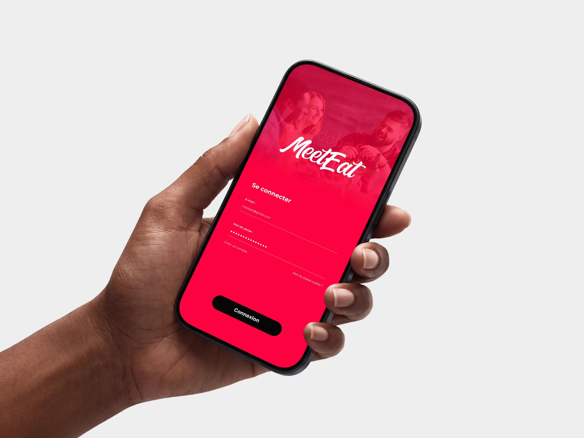
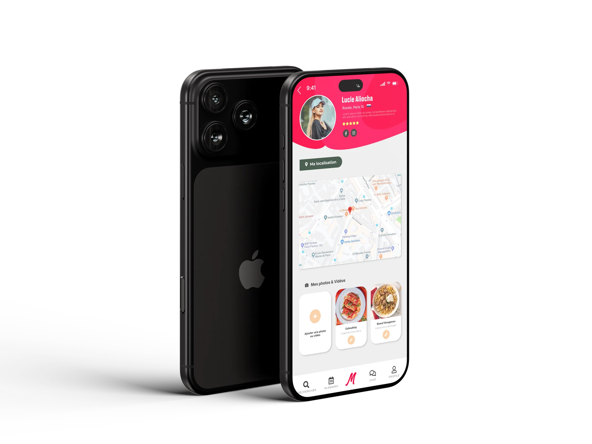
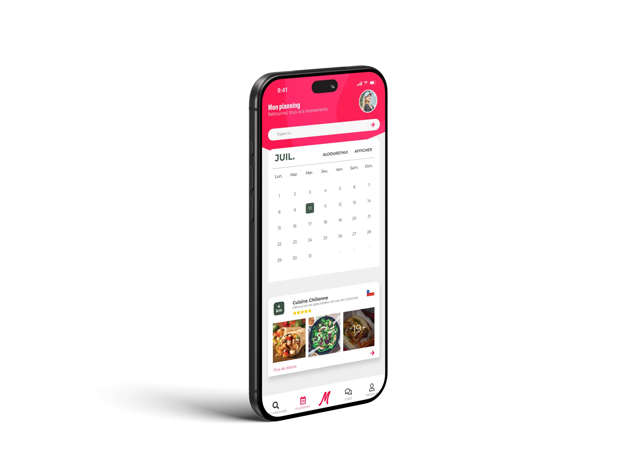
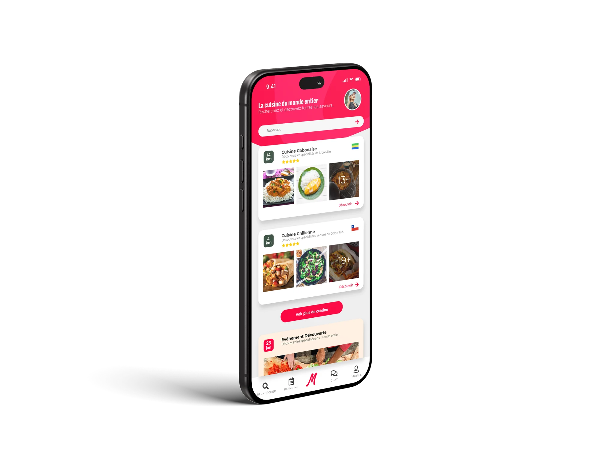
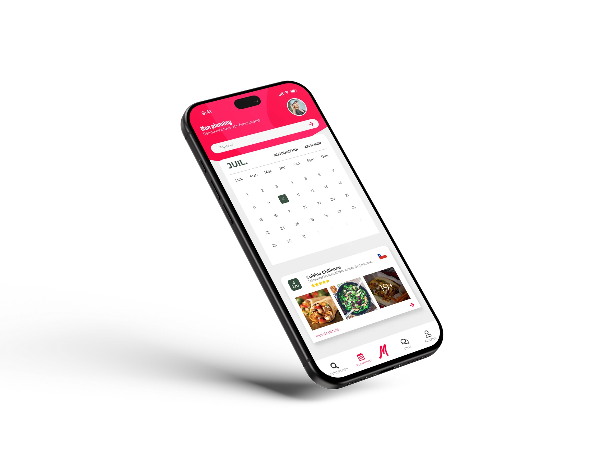
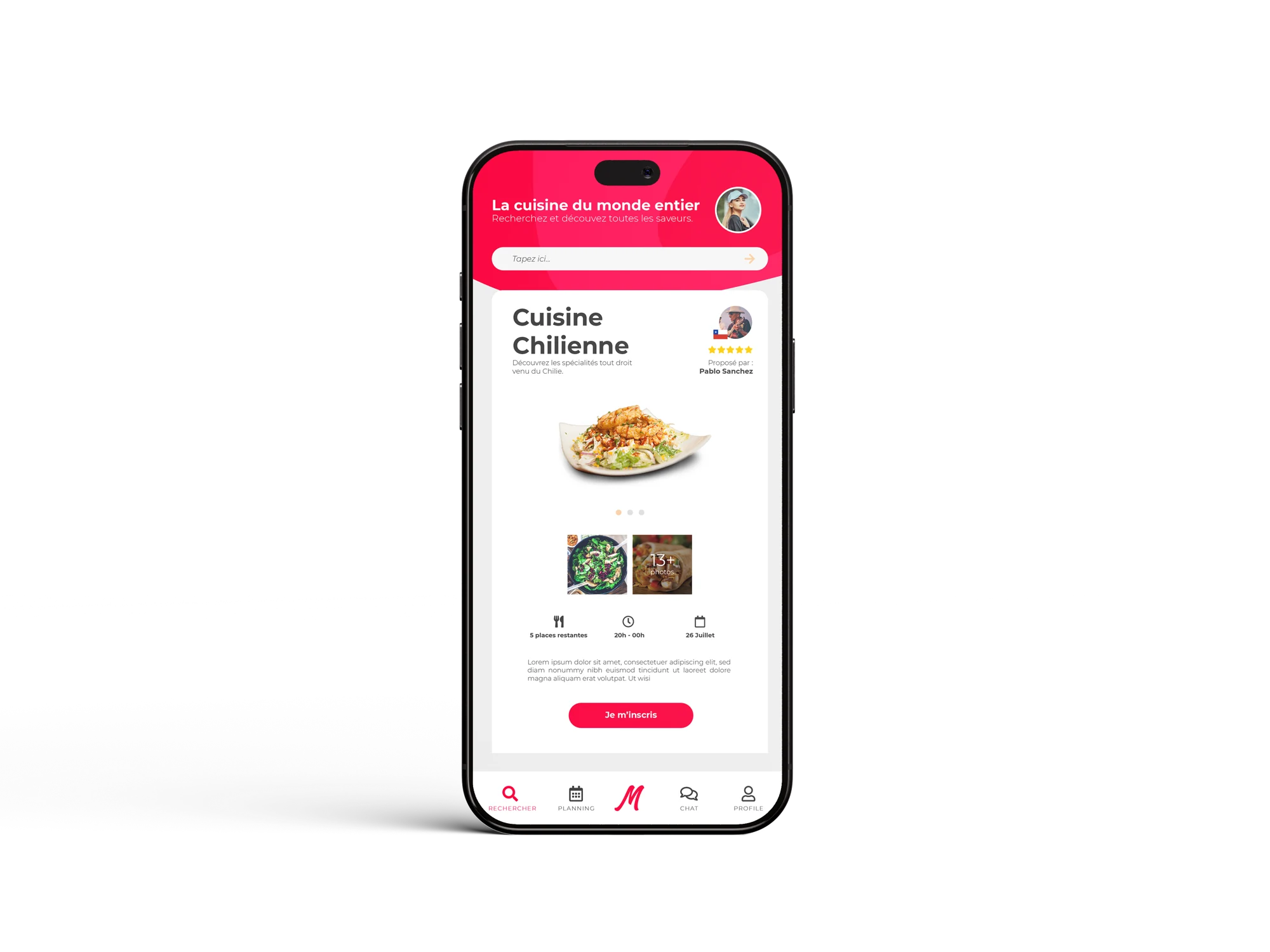
The application gives a concrete follow-up to the brand promise: log in, discover a host, check dates and find information about a meal.
- The connection in situation opens the presentation of the mobile experience.
- The host card puts a face and a location on the meeting.
- The planning and the fact sheets collect the information needed to participate: date, schedules and places remaining.
One brand across many materials
Communication, object and interface come together around one idea: making you want to meet someone through their cooking.
- The poster grabs attention; the flyer expands the world; the tote bag carries it into everyday life.
- The mock-ups show use and scale, alongside the flat artwork.
- The next step would be to strengthen the link between campaign and app with a URL or QR code on printed materials.